30 Jul Judging the box by more than just it’s cover
When I was studying packaging at University, my mentor told me how the students from the year before had produced some very nice designs, but that they wouldn’t have sold a thing in the real world.
At the time I found this contradictory, as I assumed that good design would equal good sales. But now that I have been working in the industry, I understand that there are certain elements that are necessary to appeal to consumers, which may or may not appeal to designers.
Are you being appropriate?
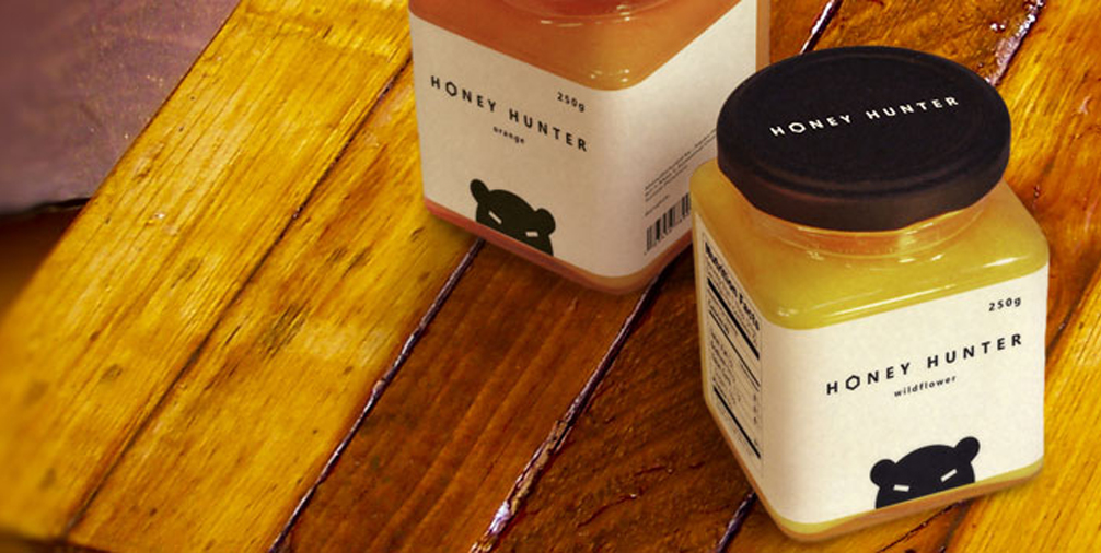
Like any category of design, you need to identify your audience and understand what appeals to them. For example, when designing packaging for certain foods, the product either needs to be visible (through clear packaging or a clear window), or there need to be an image of the product on the packaging. The majority of consumers want to know what the product they’re purchasing looks like.
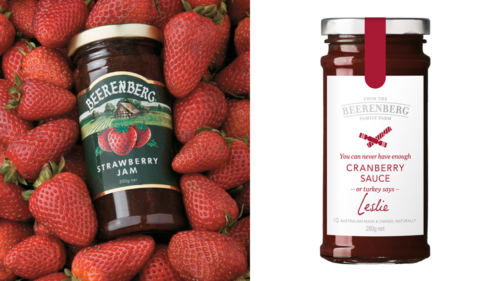
Some packaging that has undergone a recent makeover is the Beerenberg range. This is an example of package design that I feel has concentrated a little too heavily on the designer’s wants, rather than that of the target audience. While a lot of people like the new designs, many consumers assumed that the products had gone up in price from the austere appearance of the packaging. Beerenberg even had to put out a media release to reassure customers that their prices were staying the same. Brands that have a loyal following often upset consumers when they change their once familiar packaging; maybe in this case a little too much of the old character was stripped away.
Uphold your responsibilities
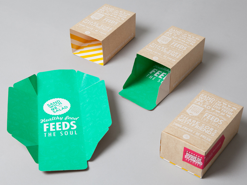
To create responsible package design, many factors need to be considered; the amount of packaging necessary, the number of glue spots, the shape/complexity of the die forme, and the lifecycle of the package.
Responsible package design attempts to use the minimum amount necessary to hold the product safely. A pet peeve of mine is the excessive use of packaging for things, such as teabags. Some companies wrap each teabag individually, place all of these inside a box with cardboard spacers between each row. This box then has multiple glue spots, and is even sometimes wrapped in clear plastic. This creates a lot of unnecessary waste, additional cost, and has a significant impact on the environment. Excess packaging is also used as a marketing tactic by many companies to fool consumers into thinking you are getting more product than you actually are (see the Choice article on this topic: http://www.choice.com.au/reviews-and-tests/food-and-health/labelling-and-advertising/marketing/excess-packaging.aspx).
Designers, assemble!
The way the package is assembled is also very important when it comes to responsible packaging. Ideally, a package should have no glue spots, which allows it to be transported flat and assembled after delivery. If glue spots are necessary, they should be kept to a minimum. If too many glue spots are used, it becomes quite expensive and also takes up a lot more space when being transported. On the other hand, if you need a particularly complicated die forme to achieve no use of glue spots, this may not be the best method either. Complex shapes will leave a lot of waste when being cut out of the stock, so simple designs with straight lines and that fit easily around each other are more economical and environmentally friendly.
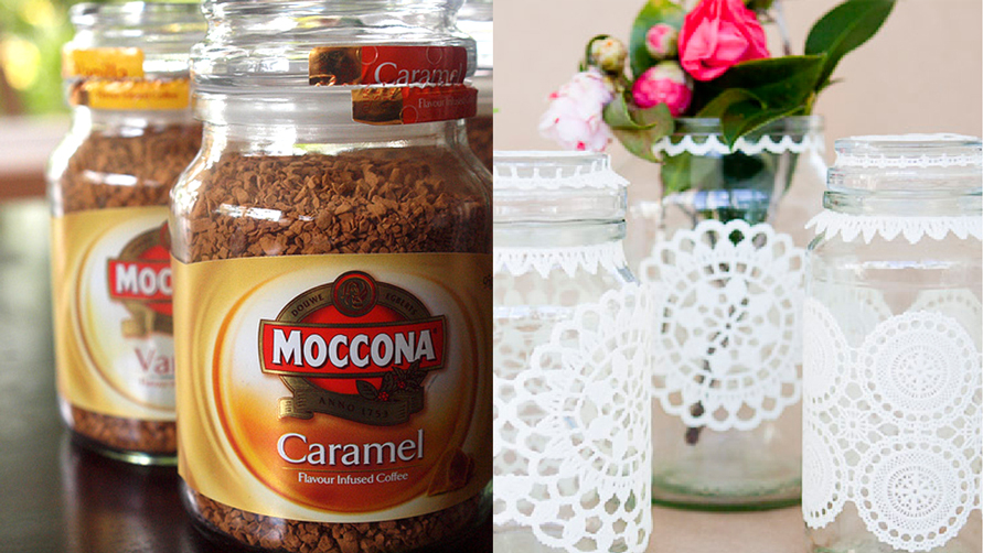
Some packaging that may seem particularly elaborate may not be as bad as you think either. Packaging that is sturdy enough can be reused after the product has been removed – even I have been know to use Moccona jars as tea canisters, cookie jars or vases. Considering how the packaging can be used after the product is removed, either by recycling or reusing, is an important part of the design process.
KISS – Keep it simple
Last, but by no means least, lets go back to the design printed on the packaging. Simpler designs will generally stand out more on the shelf, amongst all the unnecessary noise of the products around it. A well designed package will be eye catching without any extra clutter, but will still communicate all the elements and information needed by the consumer. So next time you’re in your local supermarket, take a moment to wander down the yoghurt aisle. See which one jumps out at you first – and why?