14 Apr A Few Notes on Japanese Design
In February this year I travelled to Japan for a month long venture around the country, with stops in Niseko, Sapporo, Tokyo, Nozawa Onsen, Osaka, Kyoto and Hiroshima.
This was my second visit to Japan and having recently finished my design studies, I found that I looked at things from more of a design perspective the second time around. The following is a snapshot of my trip via a short list of observations and encounters with Japanese design and culture.
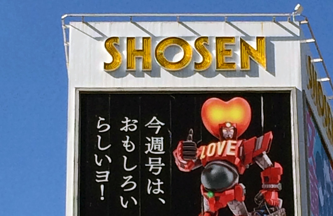
Influence of Japanese Pop Culture & Manga on Advertising & Design
The influence of pop culture and Manga is almost immediately obvious anywhere you go in Japan, especially in the larger cities such as Tokyo and Osaka. In Australia, we are familiar with Manga (comics) and Anime (Japanese Cartoons), yet it tends to attract an audience of children, teenagers and young adults. In Japan however, Manga is a big thing. It is read across virtually all sections of the population, which means there is subject matter for children, adults, and everyone in between.
This provides a great opportunity for advertising to utilise Manga elements in collateral targeted at distinct and varied audiences. This goes far beyond the use of marketing we would see in Australia, such as simply sticking characters from the latest Disney movies on tubs of yoghurt to target them at kids. Instead it’s quite common to see Manga characters and cartoon elements on advertisements for things such as real estate, credit cards, public transport and the automotive industry, all of which are clearly aimed at communicating to an adult target market. At first, this is confusing as it is hard to imagine how this kind of marketing could be successful in selling to an adult audience, but it demonstrates the importance of considering the target audience and how the designer can create a relationship with that demographic.
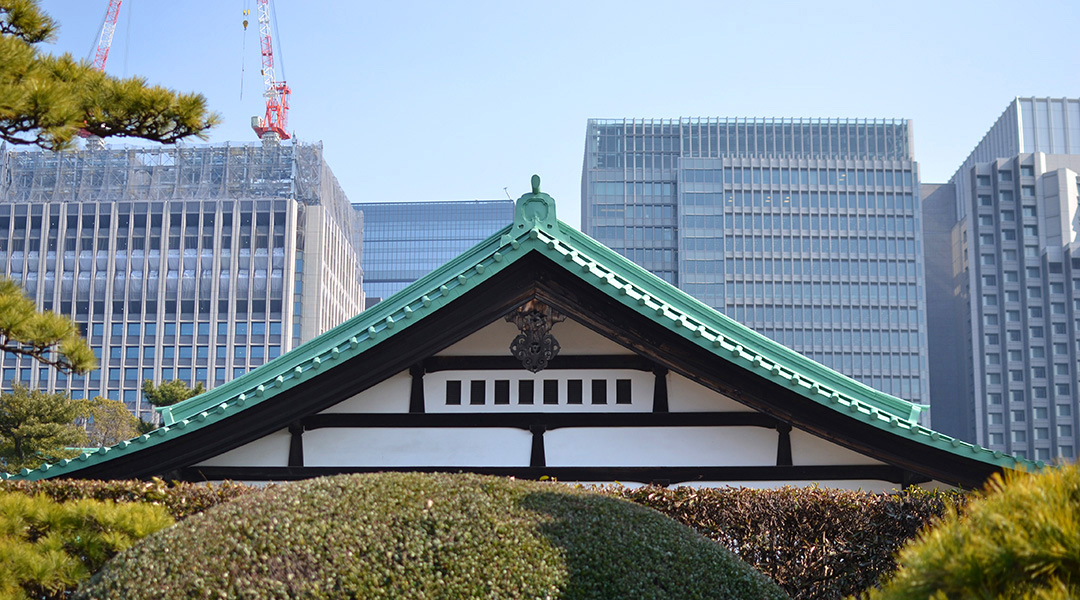
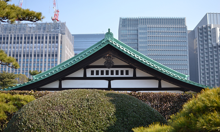
Contrast of Urban and Built Environments
In Japan, the contrast between modern and traditional is often huge, especially in terms of architecture and the built environment. This is particularly obvious in Tokyo, where urbanisation appears to have swallowed up many buildings from the Edo period amongst a sea of high rise buildings and modern infrastructure. I noticed this in particular when I visited the Meiji Shrine in Tokyo. I arrived via the JR Yamanote subway line, getting off at Harajuku station. If you exit to the east and take a walk down Takeshita Street in Harajuku, you will find yourself in the epicentre of alternative fashion, teen hangouts and all things pop culture. If you exit to the west, a short walk will take you into a quiet forest surrounded by tall trees and massive Torii gates which lead you to the Meiji Temple (built to honour Emperor Meiji, the first Emperor of Modern Japan). It’s quite unique and amazing to see a landmark of such cultural/historical significance set right next to something which is youthful, modern and fresh, and seeing the way people interact between the two.
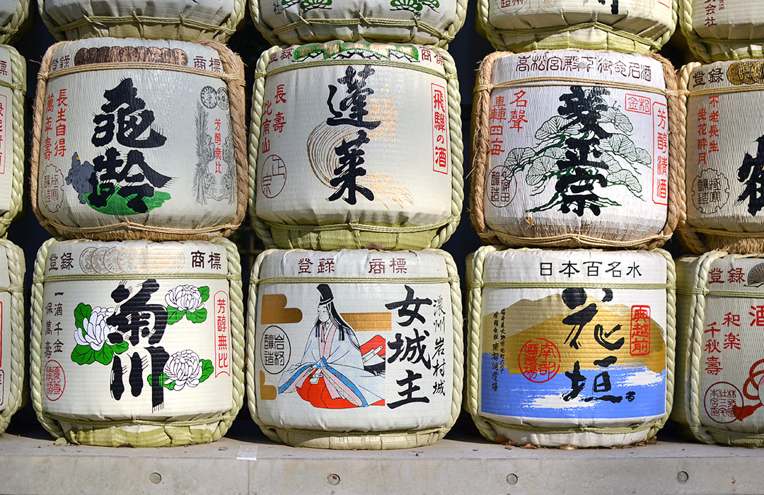
Sake, Shochu & Whiskey Branding
A trip to a local Japanese bottle shop is a goldmine for any designer interested in alcohol packaging. Sake, Shochu and Japanese Whiskeys feature particularly striking yet intricate labels. Traditional brush calligraphy features strongly on most labels, along with gold and red foils and embossing. However, while sake is generally identifiable as sake and whiskey as whiskey, from a branding perspective a lot of different spirits & brands do tend to use the same elements (especially similar brush calligraphy techniques) on their labels. This makes me curious as to whether the calligraphy makes up some form of identifiable brand or logo that allows easy differentiation between brands and varieties for the locals, or whether the bottles are simply read like any other text. Not being able to read Japanese myself, as long as I can find the Umeshu (Japanese plum wine) I am happy!
Print is Not Dead
In Australia, there seems to be a resurgence in popularity of printed materials and handmade objects of late. In Japan however, it would seem that these things never really went away. Despite being a relatively modern country especially one that is so technologically advanced, Japanese people still appear to put a high value on tactile objects. They are a country that deals predominantly in bank notes and physical currency, where bank cards dominate in Australia. Business cards and the act of giving a business card are still an important part of Japanese culture, and even something such as the ever popular Manga in many cases hasn’t converted to digital formats as may be expected. While on the subway you will still see people with eyes glued to their phones, it is just as common to see commuters with a book or newspaper in hand.
Dining Out
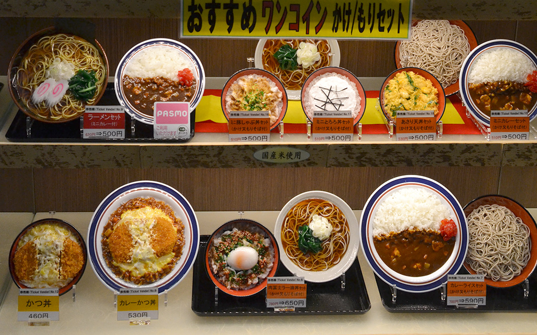
Experiencing traditional Japanese cuisine is amazing, however if you can’t read Japanese, ordering straight off the menu can be daunting. Fortunately, the Japanese like to make full-size plastic models of every dish on the menu, which you will find in the front window of many restaurants around the country. They are known as ‘sampuru’ (derived from the word ‘sample’) and make choosing what you have for dinner an experience in itself. I remember seeing these for the first time and wondering why so much time and money was spent on these plastic models when photography could probably do the same thing. Since then however, I have learnt that these plastic samples are far from just a novelty; they have been around since the early 1900s and the manufacturing process is often considered an art form in itself, and in a way, have become an icon of Japanese culture.
Fashion Trends
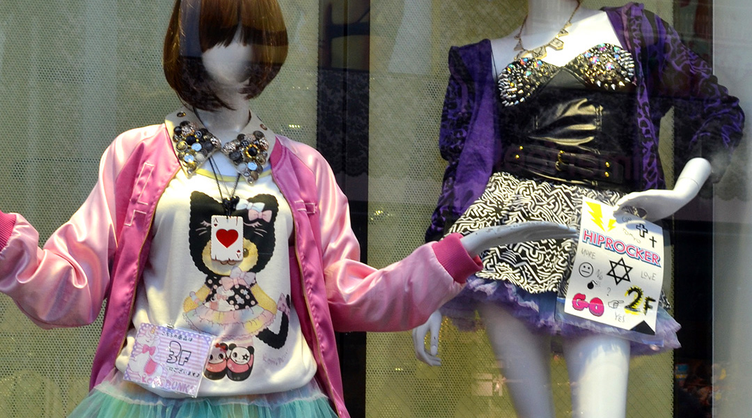
Fashion design in Japan is quite eclectic. From the stores I visited in Tokyo, I could see that designers draw obvious influence from other fashion labels/trends from around the world, particularly the US. The interesting thing about Japanese fashion however is the sheer number of fashion trends that seem to collide into one. Youth fashion in particular seems to know no boundaries. Looking at some of the clothing in stores, it is hard to imagine the trends taking off back home, but a walk down Takeshita street in Harajuku on a Sunday asserts the popularity of these trends among the Japanese youth.
Ginza Graphic Gallery
While in Tokyo I took the opportunity to visit the Ginza Graphic Gallery. The gallery is host to a number of specially planned exhibitions throughout the year with a focus on emphasizing the cultural creativity of graphic design. Showing at the time I was there was a collection of illustrations and works by British designer Paul Davis. Davis’s work often looks at life in and around London, illustrating offbeat and quirky encounters or things overheard on the subway. I found a lot of the satire and humour in his work to be distinctly British, and with no Japanese translations present, it was interesting to consider the level of engagement that one might have when there is a significant language barrier. In this respect, it was great to see an exhibition such as this in a country like Japan, as it provided a strong reminder of the relevance and impact of design as a universal form of communication, regardless of language barriers and geographical locations.
Despite becoming quite familiar with many of the quirks and oddities that make Japan so unique, it is still as fascinating and exciting as the first time I visited. Japan is an endless source of inspiration, and I would highly recommend the experience to everyone.